http://www.guardian.co.uk/artanddesign/2010/jan/20/bournemouth-imax-building-demolition
http://www.boston.com/ae/theater_arts/articles/2010/02/21/truly_ugly_buildings_offend_the_community_as_well_as_the_senses/
Is this really the best way to determine the outcome of our built environment?
On one hand it is democratic; if you consider a TV audience pressing their red buttons to be democratic. There may be worse contenders in smaller towns who could only muster a few votes. It doesn't make their case any less significant. The demolition of any building is not to be taken lightly. What is considered a good idea by one generation is seen as legalised vandalism by the next. A good example of this would be the Euston arch. A lesser known example is one stretch of Abercromby Square, Liverpool demolished to make way for a bland pile making reference to the Georgian architecture it replaced....
Betjeman described Abercromby square as being like a small town within a larger one. If that is the case a quarter of it was demolished by the University of Liverpool to make way for what was called, Senate House (now the Abercromby wing of the Sydney Jones Library).
Of course, the Imax in Bournemouth was unlikely to become a significant work of architecture but we must surely not resort to mob rule in these matters.
Wednesday, 14 July 2010
Ghastly Good Taste
"Nature is kind. She causes her creature to adapt themselves to their surroundings; to certain fish in the deepest parts of the ocean she gives enormous eyes which are able to pierce the darkness of the watery deep. To the town dweller to-day she has given a kind of eye which makes him blind to the blatant ugliness by which he is surrounded. She has affected his critical reasoning powers and his eyesight....the average man is part to blame, the architect more so.... "
Betjeman, John (1933, 1970) "Ghastly Good Taste or a depressing story of the rise and fall of English Architecture", London, Anthony Blond.
Betjeman, John (1933, 1970) "Ghastly Good Taste or a depressing story of the rise and fall of English Architecture", London, Anthony Blond.
Wednesday, 16 June 2010
Mies Van Der Rohe v's Venturi
Which house would you prefer to live in? The Farnsworth House by Mies, or with Mrs Venturi in her house designed by Robert.
The blog linked below, is in praise of the Modern in preference to the Post-Modern. [We haven't really covered much post-modern on this blog yet but it will be explored in great detail in due course....]
http://westsoundmodern.wordpress.com/2010/05/04/ugly-architecture/
In this blog the author states that the Venturi house "looks like it was built off site with spare parts gathered from demolished homes and dropped in with a helicopter without care or concern of how the home’s parts relate to the whole or how the home relates to the site. Of course this is the whole point and the goal of the post modern relativist".
I don't think this statement is true - Venturi carefully designed this house, which if the plans and sections are studied becomes overtly apparent. He is twisting the vernacular and responding to bland modernism.
According to the above blog the Mies house on the other hand, "was the product of a careful discipline. Universal laws of symmetry, geometry, and historical precedent all coming together to form a unified whole".
Yes, that maybe so, but oh, so controlled and hygienic.
Stowe Gardens, Gothic
In case you thought I was biased against Modernism and Brutalist architecture, here is something a little different....
The Picturesque English Landscape Garden:
I've now started to look for literary references to Ugliness, so wherever I come across a building or place described as ugly I'll reference it here.


Amongst the 'classical' follies, arches, bridges and columns at Stowe one finds a Gothic inspired folly. It's described in Follies, Grottoes and Garden Buildings, "Gibb's Gothic Temple is doubtless the most striking building at Stowe. It is Ugly (even to aficionados), a hideous rusty brown colour, big intrusive and wonderful. It is triangular and has nothing to recommend it apart from its solidity and its leering self-confidence".
It certainly works better as an eyecatcher from across the lake, where the eye is tricked into believing it is a fully operating church on top of the hill.

Quote taken from Follies, Grottoes and Garden Buildings, (1999) Headley & Meulenkamp, London, Aurum Press, p136.
It certainly works better as an eyecatcher from across the lake, where the eye is tricked into believing it is a fully operating church on top of the hill.

Quote taken from Follies, Grottoes and Garden Buildings, (1999) Headley & Meulenkamp, London, Aurum Press, p136.
Le Corbusier, Chandigarh, Sector-17
“M. Le Corbusier has enthusiasm and a remarkable faculty for begging the question, and whatever the value of his writings I find his buildings simply unintelligible in their purpose and wholly unpleasant to look at”[1].

Monday, 14 June 2010
Bad British Architecture
The Bad British Architecture blog has slightly different aims to Ugliness blog.
There are some astoundingly poor designs highlighted on this site, that quite frankly, wouldn't qualify them
for this blog. Here, we need to at least admire the ugliness of a building before it features, and indeed many ugly buildings have merits beyond their unfortunate genes.
However, if you want to see just how bad things can get have a peek at:
http://badbritisharchitecture.blogspot.com/
These buildings were designed by architects with seven years training. We cannot blame everything on design and build contracts.
Wednesday, 26 May 2010
The Royal Liverpool University Hospital

Designed by Holford Associates around 1963, it opened its doors to the sick and inflicted in 1978. According to Sharples the back is "undeniably impressive, if intimidating" (Sharples, 2004, "Liverpool" Yale University Press).
Perhaps the best bit is the boiler house with its 'hammer-like' chimney. The determined grid of the facade is also successful, framed by the ventilation stacks and emergency escapes at either side.
Now that various properties have been demolished in the Mount Vernon area a new view has opened up of the hospital (see photograph). I recommend interested readers head up to the Mount Vernon public house, Kensington and have a look for themselves. It certainly is impressive. The scale of the building is vast, something visitors will not necessarily experience as they approach the hospital entrance because of the podium.
Monday, 24 May 2010
Technosis extronality cluster fuck
Strong words from James Howard Kunstler.
Another great lecture posted on TED.
Unfortunately he goes on about 'places not worth caring about' -
and makes a tenuous link between America's worst places and the
wars in the Middle-East and Afghanistan.....
Monday, 10 May 2010
Ugly Architecture on Flickr

Well I never, a group on Flickr devoted to my favorite topic!
There are some real gems here such as Boston City Hall: (photo by joe shlabotnik)
There are others that are photographed in a too 'arty' manner. If it is an ugly building don't try to make it look better through choreographed photography.
Ugly buildings can still make great architecture
The incomplete, unfinished, and unkempt can still make good architecture. An unresolved ambiguous composition [i.e. post-structuralist] is often more satisfying than the finished and complete [i.e. structuralist]
Perhaps as we engage with the 'death of the author', and begin to acknowledge the presence of the 'reader' we create space for 'un-complete' and fragmented solutions.
The World's Ugliest Buildings?
Come on Guardian, you must be able to do better than that!
The Guardian lists the following as being the World's Ugliest Buildings:
1. House of the Republic (now Palace of the Parliament), Bucharest
Nicolae Ceaucescu's monumental folly still holds world records for the largest civilian administrative building, most expensive administrative building, and heaviest building in the world. Constructing it required demolishing much of Bucharest's historic district, including 19 Orthodox Christian churches, six Jewish synagogues, three Protestant churches, and 30,000 residences. It's still unfinished.
2. Buckingham Palace, London
Home to the second-longest lasting unelected head of state in the world, let's face it, it's monolithic and could have been built by Stalin. Nash no doubt did his best to beautify a pig, but a pig it remains.
3. Ryerson University Library, Toronto
Proving that democracy can also be brutal (just ask the Iraqis), this 11-storey tower looks more like a second world war fortification than a temple of learning. The sort of place you wouldn't want to be late returning books to.
4. Any McDonald's drive-thru, anywhere
They are to architecture what the Happy Meal is to nutrition. And they're always the same. Everywhere. Around the world. No matter where they've plonked them. Vernacular? What's that?
5. St George Wharf, London
Butterflied prawns are good, butterflied roofs are not. What were they thinking? Occasionally voted the UK's most hated building, it probably wouldn't look out of place in Shanghai.
How did Italy get so Ugly?
I don't know, it seems alright to me.......
Sunday, 9 May 2010
Spending a Penny: The Humble Public Convenience
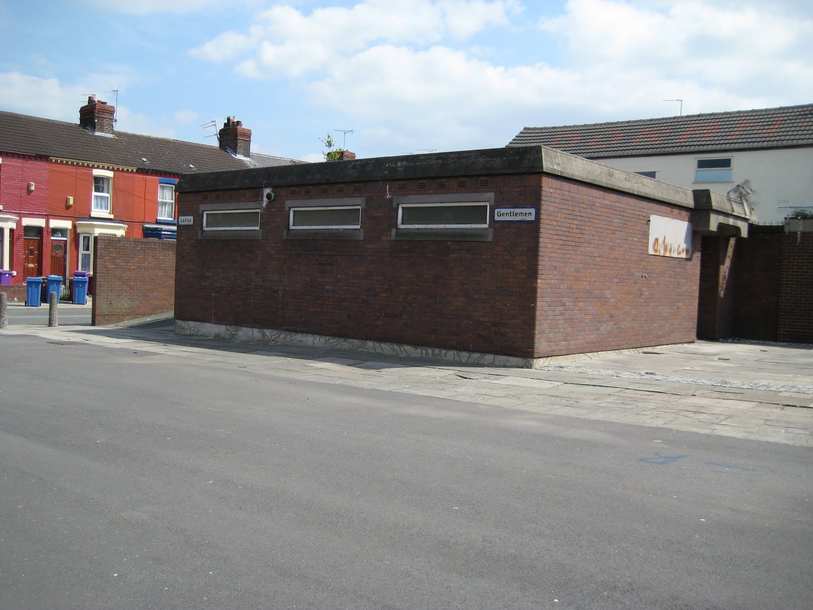
Unlike the current trend for prefabricated WC's that we find in our city centres of late, previous versions were far more substantial and determined.
Here we see a squat brick structure with high level openings and flat roof.
The structure is split into two rooms; one for male customers, the other for female.
Although now synonymous with the popular trend for 'cottaging', they represent a caring civic attitude and concern for the welfare of visitors to the city.
Whilst there is a stark functionalist aesthetic to the structure, other functions such as hygiene, beauty and safety are sadly neglected. There is a meanness to the architecture, its defensive form and materials attempting to withstand abuse and vandalism.
Saturday, 8 May 2010
The Death of Modernism


Here we see La Princesse [a giant mechanical spider, see http://www.lamachine.co.uk/] descending down the side of Concourse House in Liverpool.
Located on a key site next to Lime Street Station the building represented post-war optimism through its high-rise, high specification and city views.
In reality it was ill-located, poorly maintained and perhaps represents the worst of modernist design through its monotonous facade and lack of concern for how the building touched the ground plane.
The spider's bite sealed the buildings fate and it has now been demolished.
What will take its place? The land value of this site must be considerable and rental incomes could be significant....
Derelict or Ruin

When does a derelict building become a ruin? Regular readers will recall my previous blog on ruins [http://thearchitectureofugliness.blogspot.com/2010/01/ruins.html]!
When does a delapidated, sad, empty, abandoned, redundant building become that special artifact we cherish as a ruin?
We return to Liverpool again to Edge Lane. There has been a 'compulsory purchase order' placed on these tremendous Victorian dwellings. This means the owners have been forced to relinquish their homes. The reason for this is to allow road widening/traffic alterations from the M62 motorway into Liverpool city centre.
If that wasn't bad enough, the windows of the properties have been boarded up and painted in some hideous "graffiti-style" fashion. This is clearly bad art, and perhaps a definition of ugliness.
Friday, 7 May 2010
Sign On: A nice piece of brutalism

This is a Job Centre in Liverpool. Why is it a bunker? Why is this public building so defensive? Who is being protected and from whom?
Upon closer inspection however, it isn't all as it first seems. The roller shutter leaves the bottom of the door exposed......
The band of concrete at first floor level is really a formal device: it serves no function beyond suggesting an aggressive, confrontational architecture.
Above the concrete band is a reclining glazed-cladding upper section; hardly fortress.
Sunday, 3 January 2010
Cemetery
 The Cemetery
Within our cities and towns we set aside designated places for the burial of our dead. The photographs on this blog are taken from Smithdown Road Cemetery, Liverpool. A quick look at the Ordnance Survey Maps of Liverpool reveals that the cemetery was located well away from the city when it was first built - presumably to ensure that disease was kept well away from the inhabitants. Eventually the city engulfed the cemetery and a Workhouse [designed by Culshaw & Sumners] was built next door to the grave yard - presumably because land was cheap and it reduced the travel distance: in one door - out the other.
Today, despite the drunkards and the Staffordshire bull terriers it is a delightful setting. Its ugliness comes through the ostentatious vanity of some of its occupants. The futile attempts at immortality and claiming importance in death as in life, or perhaps I'm mistaken, and the extravagant commemorations are displays from loved ones. We see a  variety of styles, miniature gothick Albert Memorials, peculiar cenotaphs with sculpture & bas relief and the inevitable urns. A collection of obelisks creates an interesting display, some with vastly over-scaled pedestals reducing the obelisk to a mere finial.
 variety of styles, miniature gothick Albert Memorials, peculiar cenotaphs with sculpture & bas relief and the inevitable urns. A collection of obelisks creates an interesting display, some with vastly over-scaled pedestals reducing the obelisk to a mere finial.
Ruins
Abandoned buildings, dilapidated structures: they are signs of previous human occupation.
The ruins below are not ugly though. They are the clean white bones; not the decaying carcass that we find repulsive, the abandoned building occupied by pigeons.
At what point is the delapidation complete and the status of ruin achieved. At what point does romanticism take over from the sadness of waste and neglect? Perhaps it is the tenacity of the ruin that intrigues us. Its defiance to resist complete demolition and to remain more seemingly permanent than an occupied useable and 'functional' structure. The ruin played such an important part in the Western Renaissance. We returned to Rome, Greece and Turkey to measure such things as tools for estalbishing our future course. Could they be in-grained as a collective memory. The ruined Bank of England more certain as a ruin that Soane's incomplete version.


Saturday, 2 January 2010
Cabients of Curiosities

We have a special relationships with things, objects, stuff, art, belongings and collections. We are what we own and we form a 'collective' identity through our national collections.
Cabinets of Curiosities have contained the unusual, the peculiar and the grotesque [i.e the ugly], as well as the unique, precious, rare and splendid (the sublime), and in that sense they form the perfect studies, as they illustrate our fascination with the ugly as well as our marveling at the beautiful.
The desire to own 'one of everything'....
My own foray into this dark and dirty domain has been through taxidermy.
A connection with death and yet the preservation of the illusion of life.
Image: Stoat Trophy mounted on rectangular timber shield.
Taxidermy: Whilst taxidermy may not be popular mass culture, it has seen something of a revival in recent years, especially in Modern Art [possibly stemming from Hurst's works].
To some taxidermy is a morbid creation symbolic of hunting, imperialism and cruelty, and in the past this may have been partially true, but it has always been more than that.
It has also featured in some poorly executed museum displays and equally is still found in some delightful curatorial feats [as found in the Manchester Museum, New Yorks Natural History Museum and the Pitt Rivers Museum]. What better way of learning about an animal than actually seeing it {- yes, of course there is no substitute for seeing an animal 'in the wild' etc etc. }
Taxidermy is one of those topics that spans established genres. It is both a science and an art form. It is concerned with our natural surroundings, the beauty of creation, and also with fiction and narrative. Each taxiderm tells a story and sets a scene. It enables us to become un-naturally close to animals that would otherwise be out of reach. It possibly reminds us of death, but for me it is the marvel of looking at a wild animal, preserved and removed from passing time, seasons and the cycle of life.
Many people are scared when they first encounter a taxidermy specimen. Perhaps this relates to an inner ancient mode of self-preservation. We still feel fear when we see a lion form, regardless of whether it is alive or taxidermed.
Wednesday, 30 December 2009
Visionary Environments
Visionary Environment is the term given to constructions/places/spaces built by certain artists.
They are installation pieces, 'land art' compositions often containing some kind of message, but not always. Unlike sculpture or installations built by trained artists, visionary environments are built by artists without formal or academic training. Levi Strauss', "Le Bricoleur" comes close to describing these creative agents, often working with found, gathered or recycled objects, they 'make-do-and-mend', 'waste not' and re-appropriate objects in new ways often independent of their original function.
My blog on Kevin Duffy (see also Raw Vision's website) describes one such environment, located in the UK. There are many other sites throughout the world, although France and USA seem to have largest numbers....
The largest environment (to date) in terms of area and wonderment is located in India, constructed by Nek Chand. It is a 17 acre site filled with sculptures, waterfalls, follies and castles.
These artists often use concrete, which is a malleable, readily available material and quickly cast and formed into shapes. Into the concrete is set various objects, such as glass, tin cans, bangles and so on. Nek Chand has used found mud guards, bicycle frames, exhaust pipes as reinforcement onto which he adds the cement. This method of using 'ready-mades' dictated a lot of his early work. Kevin Duffy has also successfully used ready-made forms, such as buckets and traffic cones. He has even produced his own latex moulds into which he casts concrete.
Friday, 20 November 2009
Kevin Duffy's Garden Centre, Wigan, UK
Kevin Duffy has spent the last thirty-one years building his own Tudor Village and experimenting with historical vernacular-style buildings at his garden centre near Wigan, England. Kevin is now sixty-two years old and states that the work simply evolved from his love of building, but unlike the conventional need for shelter or function his works are all follies.
Their only purpose is to satisfy a need in Kevin to build, to create something that he enjoys looking at. The works also enable Kevin to ponder the past and to think about the people that once lived in buildings similar to the versions he creates.
Kevin left school at the age of fifteen and like lots of people at that time in Lancashire, went to work in the cotton mills. He worked fifty-six hours per week and had over an hours walk to work and back each day. After a period of economic decline, the northern mills began to close and Kevin was forced to make his living through musical performance, playing with his wife Pat, across the county in pubs and clubs.
During the daytime he continued to develop his interest in growing plants and vegetables and took over an allotment. He purchased a house adjacent to the allotment field and began clearing the scrubland and neglected allotments, which took around six years of daily labour. During this time he began selling plants and cuttings to passers by and his reputation as a quality plant supplier grew. Almost by accident he had transformed the allotment into a business and spent everyday tending to his nurseries. He eventually sold the house and built a bungalow on the site where he now lives and manages the nursery along with his son, Carl. His move onto the site also enabled him to spend extended periods of time working on his structures and to live within his bygone fantasy.
He has very strict rules with respect to his building methods and may only use found or donated objects. He sometimes decides to swop one object for another, more preferable one, and will even use something that is ‘new’ providing it is donated and not specifically bought for the task. His calls this system, ‘the standard’ and it has resulted in some extraordinary uses of materials independent of their original function.
Most of the work is routed in Kevin’s interpretations of classic English vernacular styles. He is particularly fond of the Lake District in the north of England and also enjoys the Stately homes of Yorkshire. It is from these places, that he occasionally visits, that he draws most of his inspiration. However through his own private study of books and pamphlets [some of which are brought by visitors to the site] Kevin has widened his sources to as far a field as Egypt and South America.
He studies the principles behind the styles and has spent considerable time, for example, perfecting ‘gothic’ arches. He told me that the ‘Roman’ arch is easy to construct as a dustbin on its side can be used as a former, whereas the gothic arch needs special consideration.
The work is for the most part a façade-based installation. Very few of the structures have an interior, they are built more like stage sets along a continuous wall that stretches 460ft. The facades are constructed using reclaimed interior doors. A mesh is then fixed to the doors, which, enables the final layer of sand-cement render to be applied. Using this method Kevin has been able to construct his Tudor village and Tea Shop. He sells sand and cement at the garden centre which keeps him in regular supply. In addition to the facades there are other more three-dimensional works, such as a castle and tower structure. Kevin thinks about the perspectives and axis that are created by his installations. He explained to me how he thinks of the foreground, middle and distance views, being careful to place structures at key moments to create a scene and carefully composed arrangement. As a result, the visitor is gently led through the site, in a similar way to the Renaissance gardens and their follies.
He has developed a small chapel, with an alter constructed from old railway sleepers and kitchen cabinets. The chapel is well received by visitors who light candles and donate to the collection tin that Kevin then gives to various charities. It is certainly a spiritual place and one is startled when leaving the church to realise that this place is within a working garden centre. However, in contrast to the commercial, ‘force grown’ and expensive world of horticulture, this place is only a ‘garden centre’ by name, even by default. It has really transcended that world being a convenient backdrop to the project as well as helping with the bills.
The Tudor Village is laid out as if part of a village square and the collection of around ten houses, clock towers and statues create a realistic setting. The scale of the work is slightly smaller than life size. Most of the buildings in the village have their own clock, located on the front façade and many have bells. Kevin collects these objects and for a period in the 1960’s even received payment in the form of Grand Father clocks for work he did for an antique dealer. Many of these clocks are still in Kevin’s home whilst the damaged and unwanted versions are reused in his constructions.
A variety of objects and building components are salvaged from demolished buildings and Kevin has managed to obtain capstones from Wigan polio hospital, bollards from Liverpool’s docks through to the peculiar, such as a donkeys grave stone. To store these objects he has a built a museum and an antique shop. Nothing is for sale, but along with the tearooms and Tudor village, they invoke a distant, perhaps fantasy view of England.
Kevin also departs from this picturesque village scene with his small niche devoted to the ancient Egyptians and a larger scene that he has labeled, ‘Aztec’. The Aztec section is a small enclosure for a family of ducks to live in. It consists of a series of large painted concrete scrolls embellished with additional ornamentation and rendering. He has also created a monument to his wife, who passed away twelve years ago. Within this discrete memorial he has set a small angel and it serves as a moving tribute to Pat, whom Kevin clearly misses.

Whilst I was at the site, Kevin was working on the latest addition; a small villa located within a very tight corner of the site. Kevin enjoys surprising visitors and at various points there are mannequin heads and figures to shock the visitors. Within the villa he is planning on positioning a figure. He can only work on the project sporadically throughout the day as he gets called away to serve in the garden centre, however despite this distraction he is preparing the ground for a ‘Victorian London’ section, due for completion within six months. It is fascinating to see this garden develop and to listen to its creator explain the significance of particular aspects and features. These explanations clearly add meaning to the site and Kevin enjoys retelling these tales, using the garden both as a diary and as a tribute to medieval and Romantic styles.
This article was originally published in Raw Vision Magazine, no. 62. Please support this magazine as it is world class, and has continuously produced some of the most seminal writing/photos for well over ten years now.
Kevin's latest work has shifted from architecture towards sculpture. He has developed several sculptures, depicting human forms and often relating to historical characters, such as Jane Austin's Mr. Darcey.
Their only purpose is to satisfy a need in Kevin to build, to create something that he enjoys looking at. The works also enable Kevin to ponder the past and to think about the people that once lived in buildings similar to the versions he creates.
Kevin left school at the age of fifteen and like lots of people at that time in Lancashire, went to work in the cotton mills. He worked fifty-six hours per week and had over an hours walk to work and back each day. After a period of economic decline, the northern mills began to close and Kevin was forced to make his living through musical performance, playing with his wife Pat, across the county in pubs and clubs.

During the daytime he continued to develop his interest in growing plants and vegetables and took over an allotment. He purchased a house adjacent to the allotment field and began clearing the scrubland and neglected allotments, which took around six years of daily labour. During this time he began selling plants and cuttings to passers by and his reputation as a quality plant supplier grew. Almost by accident he had transformed the allotment into a business and spent everyday tending to his nurseries. He eventually sold the house and built a bungalow on the site where he now lives and manages the nursery along with his son, Carl. His move onto the site also enabled him to spend extended periods of time working on his structures and to live within his bygone fantasy.
He has very strict rules with respect to his building methods and may only use found or donated objects. He sometimes decides to swop one object for another, more preferable one, and will even use something that is ‘new’ providing it is donated and not specifically bought for the task. His calls this system, ‘the standard’ and it has resulted in some extraordinary uses of materials independent of their original function.

Most of the work is routed in Kevin’s interpretations of classic English vernacular styles. He is particularly fond of the Lake District in the north of England and also enjoys the Stately homes of Yorkshire. It is from these places, that he occasionally visits, that he draws most of his inspiration. However through his own private study of books and pamphlets [some of which are brought by visitors to the site] Kevin has widened his sources to as far a field as Egypt and South America.
He studies the principles behind the styles and has spent considerable time, for example, perfecting ‘gothic’ arches. He told me that the ‘Roman’ arch is easy to construct as a dustbin on its side can be used as a former, whereas the gothic arch needs special consideration.
The work is for the most part a façade-based installation. Very few of the structures have an interior, they are built more like stage sets along a continuous wall that stretches 460ft. The facades are constructed using reclaimed interior doors. A mesh is then fixed to the doors, which, enables the final layer of sand-cement render to be applied. Using this method Kevin has been able to construct his Tudor village and Tea Shop. He sells sand and cement at the garden centre which keeps him in regular supply. In addition to the facades there are other more three-dimensional works, such as a castle and tower structure. Kevin thinks about the perspectives and axis that are created by his installations. He explained to me how he thinks of the foreground, middle and distance views, being careful to place structures at key moments to create a scene and carefully composed arrangement. As a result, the visitor is gently led through the site, in a similar way to the Renaissance gardens and their follies.

He has developed a small chapel, with an alter constructed from old railway sleepers and kitchen cabinets. The chapel is well received by visitors who light candles and donate to the collection tin that Kevin then gives to various charities. It is certainly a spiritual place and one is startled when leaving the church to realise that this place is within a working garden centre. However, in contrast to the commercial, ‘force grown’ and expensive world of horticulture, this place is only a ‘garden centre’ by name, even by default. It has really transcended that world being a convenient backdrop to the project as well as helping with the bills.
The Tudor Village is laid out as if part of a village square and the collection of around ten houses, clock towers and statues create a realistic setting. The scale of the work is slightly smaller than life size. Most of the buildings in the village have their own clock, located on the front façade and many have bells. Kevin collects these objects and for a period in the 1960’s even received payment in the form of Grand Father clocks for work he did for an antique dealer. Many of these clocks are still in Kevin’s home whilst the damaged and unwanted versions are reused in his constructions.
A variety of objects and building components are salvaged from demolished buildings and Kevin has managed to obtain capstones from Wigan polio hospital, bollards from Liverpool’s docks through to the peculiar, such as a donkeys grave stone. To store these objects he has a built a museum and an antique shop. Nothing is for sale, but along with the tearooms and Tudor village, they invoke a distant, perhaps fantasy view of England.
Kevin also departs from this picturesque village scene with his small niche devoted to the ancient Egyptians and a larger scene that he has labeled, ‘Aztec’. The Aztec section is a small enclosure for a family of ducks to live in. It consists of a series of large painted concrete scrolls embellished with additional ornamentation and rendering. He has also created a monument to his wife, who passed away twelve years ago. Within this discrete memorial he has set a small angel and it serves as a moving tribute to Pat, whom Kevin clearly misses.

Whilst I was at the site, Kevin was working on the latest addition; a small villa located within a very tight corner of the site. Kevin enjoys surprising visitors and at various points there are mannequin heads and figures to shock the visitors. Within the villa he is planning on positioning a figure. He can only work on the project sporadically throughout the day as he gets called away to serve in the garden centre, however despite this distraction he is preparing the ground for a ‘Victorian London’ section, due for completion within six months. It is fascinating to see this garden develop and to listen to its creator explain the significance of particular aspects and features. These explanations clearly add meaning to the site and Kevin enjoys retelling these tales, using the garden both as a diary and as a tribute to medieval and Romantic styles.
This article was originally published in Raw Vision Magazine, no. 62. Please support this magazine as it is world class, and has continuously produced some of the most seminal writing/photos for well over ten years now.
Kevin's latest work has shifted from architecture towards sculpture. He has developed several sculptures, depicting human forms and often relating to historical characters, such as Jane Austin's Mr. Darcey.
Tuesday, 17 November 2009
Authorship and modernity in Chandigarh: the Ghandi Bhavan and the Kiran Cinema designed by Pierre Jeanneret and Edwin Maxwell Fry - The Journal of Architecture

This blog will contain brief discussions from academic papers I've published elsewhere. The reason for this is to disseminate the work to a wider audience [hopefully!] and to create a forum for feedback/debate not normally possible with journal articles. It also creates a place to condense ideas into a couple of hundred words rather than the extended 6-8000 word format of the academic paper. The link below will take the reader to the full paper...

A brief synopsis
The main aim of the paper above is to discuss two buildings, with a view to understanding the developments of Modernism within Chandigarh, India. The first building is a cinema designed by Maxwell Fry, the second The Ghandi Bhavan, [a Ghandian Philosophy school] by Pierre Jeanneret.
The paper, after an extensive literature review, examines how Fry's work was instrumental in helping create the identity of Chandigarh's first 'Sector'. It did this not only through the physical presence of the cinema, but also through the films it showcased.
The style of the building invokes the 'art deco' / jazz moderne theatre that was already a familiar sight in India's metropolitan cities. The main facade faces onto a public square, taking the role of the church in the Italian piazza typology.
The Ghandi Bhavan, designed approximately ten years after the Kiran Cinema shows a very different approach to the established idea of Modernity shown in the cinema. The cinema was built in the very early stages of the cities development when materials were limited and the workforce was devoted to constructing residential units.
The Bhavan was built for the Panjab University, as the key building in its campus. Like two of Le Corbusier's buildings in Sector-1 it 'floats' on the reflection pool that surrounds it on all sides.
The building is used to house a library of Ghandian philosophy and contains a lecture theatre. However, this is really a building acting as a monument - the function is secondary. On plan it adopts a rotational symetrical pattern [perhaps invoking the Indian wheel], a contrary approach to the overt symetry of the Kiran Cinema facade. Another major difference is the use of white stone cladding - a complete departure from the exposed baton brut concrete deployed in the rest of Chandigarh. The Bhavan is also surrounded by buildings clad in red sandstone [again indicating additional wealth] possible invoking the setting of the Christi Tomb at Fatephur Sikri. 
These additional materials create a link between Chandigarh and the Mughal architecture found throughout Northern India. Perhaps Jeanneret was attempting to create a visual historical link between the [pre-Imperial] Mughal dynasties and the post-colonial Independent Indian architecture. Chandigarh, of course, was not intended to have any references to India's past, or indeed any other historical references. It was to be distinctly Modern. By introducing these materials, Jeanneret was acknowledging the past, creating a historical context for the new Chandigarh buildings.

These additional materials create a link between Chandigarh and the Mughal architecture found throughout Northern India. Perhaps Jeanneret was attempting to create a visual historical link between the [pre-Imperial] Mughal dynasties and the post-colonial Independent Indian architecture. Chandigarh, of course, was not intended to have any references to India's past, or indeed any other historical references. It was to be distinctly Modern. By introducing these materials, Jeanneret was acknowledging the past, creating a historical context for the new Chandigarh buildings.
Sunday, 15 November 2009
The Trafford Centre
This blog begins as a weak response to Alan De Botton's book, 'The Architecture of Happiness'. I really enjoy De Bottons work, and the above title is no exception: however I want to expand on his work [and also on Eco's seminal work on Ugliness and Beauty in art] to discuss notions of Ugliness and the Sublime within architecture.
Are notions of ugliness simply a matter of taste?
Why can we gain so much pleasure from decay, dis/mis-use, abandonment, banality, pastiche, etc. . . .all of which are usually viewed negatively
The works may not be intended to be anything but functional - yet as a by-product there is something attractive about them. In other cases they may be designed and considered by the designer/client/user to be beautiful/pleasant, and yet considered distinctly naff by others [i.e. design professionals, such as architects]. This is the case with the Trafford Centre, as shown in these photo's. The Trafford Centre is one of the largest shopping centres in Europe, located in Manchester, England. The interior is a neo-rococo style with ornate classical columns, friezes, murals and plastic privet hedges 'trimmed' into obelisk topiary. The experience of shopping here is not unpleasant. I enjoy the hoards of people, the noise, the commerce and fanaticism of dedicated shoppers on a grey, wet [typical] Manchester weekend. Clearly here, like all retail environments, the setting, design and space of the building are carefully considered - nothing is left to chance and teams of marketing analysts dedicate substantial research into retail space and the customer experience. The people behind the Trafford centre have chosen to adopt classical motifs as appropriate architecture - this is an interpretation on ecclesiastical scales with the Medicci's wealth. The large-scale murals of cherubs and angelic beings clinging to whispy clouds set against the bluest of skies is not something I've seen outside of European cathedrals.
It is not restrained minimalism.
It is flamboyant mannerism.
Is this shopping claiming to be a religious experience? Or is it about 'bling' culture, where this kind interior design is considered wealthy, exclusive and desirable?
Probably a bit of both.
It is banal retail space in 'fancy-dress'. The central 'street' creates illusion of pomp, extravagance and carnival masquerade, whilst borrowing from the Victorian arcade-American Mall.
Most architects would consider this to be completely terrible. Perhaps it is. People like it. Perhaps it is better than poor attempts at good design, the predictable, tedious shop fitting.
Another less interesting approach is the large shed with main door and signage stuck to the front - as discussed by Venturi in 'Learning from Las Vagas'.
My conclusion so far is that whilst for most visitors - the design goes largely un-noticed. For others, it is repulsive and they will avoid the space anyway. For a small few, it is an amusing setting, overly sickly, enjoyably distasteful and a place to spend money in John Lewis' and T.M Lewin.
Are notions of ugliness simply a matter of taste?
Why can we gain so much pleasure from decay, dis/mis-use, abandonment, banality, pastiche, etc. . . .all of which are usually viewed negatively
The works
 may not be intended to be anything but functional - yet as a by-product there is something attractive about them. In other cases they may be designed and considered by the designer/client/user to be beautiful/pleasant, and yet considered distinctly naff by others [i.e. design professionals, such as architects]. This is the case with the Trafford Centre, as shown in these photo's. The Trafford Centre is one of the largest shopping centres in Europe, located in Manchester, England. The interior is a neo-rococo style with ornate classical columns, friezes, murals and plastic privet hedges 'trimmed' into obelisk topiary. The experience of shopping here is not unpleasant. I enjoy the hoards of people, the noise, the commerce and fanaticism of dedicated shoppers on a grey, wet [typical] Manchester weekend. Clearly here, like all retail environments, the setting, design and space of the building are carefully considered - nothing is left to chance and teams of marketing analysts dedicate substantial research into retail space and the customer experience. The people behind the Trafford centre have chosen to adopt classical motifs as appropriate architecture - this is an interpretation on ecclesiastical scales with the Medicci's wealth. The large-scale murals of cherubs and angelic beings clinging to whispy clouds set against the bluest of skies is not something I've seen outside of European cathedrals.
It is not restrained minimalism.
It is flamboyant mannerism.
Is this shopping claiming to be a religious experience? Or is it about 'bling' culture, where this kind interior design is considered wealthy, exclusive and desirable?
Probably a bit of both.
It is banal retail space in 'fancy-dress'. The central 'street' creates illusion of pomp, extravagance and carnival masquerade, whilst borrowing from the Victorian arcade-American Mall.
Most architects would consider this to be completely terrible. Perhaps it is. People like it. Perhaps it is better than poor attempts at good design, the predictable, tedious shop fitting.
Another less interesting approach is the large shed with main door and signage stuck to the front - as discussed by Venturi in 'Learning from Las Vagas'.
My conclusion so far is that whilst for most visitors - the design goes largely un-noticed. For others, it is repulsive and they will avoid the space anyway. For a small few, it is an amusing setting, overly sickly, enjoyably distasteful and a place to spend money in John Lewis' and T.M Lewin.
Subscribe to:
Posts (Atom)
